

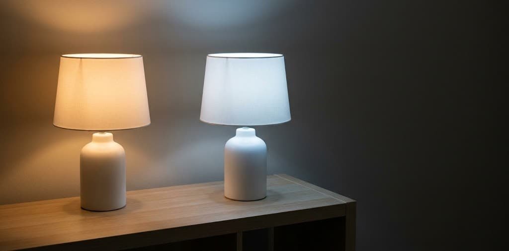
Two identical lamps, two bulbs from two different packages, and a living room that suddenly looks like it belongs to two different houses — one lamp glowing amber and relaxed, the other casting a slightly blue-white light that reads more like an office. Nothing about the fixtures changed. The only difference is the color temperature printed in small text on each bulb’s box, a number most people never look at until a room like this makes them start.
This guide explains what that number actually means and, more importantly, why consistency across a room matters more than which specific temperature you choose. Get that one principle right and the rest of the decision becomes considerably simpler.
What Color Temperature Actually Measures
Every bulb has a color temperature measured in Kelvin, printed on the packaging, and it describes where the light falls on a scale from warm amber to cool blue-white — not the physical heat of the bulb itself, despite the confusing name. Lower Kelvin numbers, roughly 2700 to 3000, produce warm, amber-toned light close to candlelight or an incandescent bulb. Higher numbers, 4000 and above, shift toward a whiter, cooler light, and numbers above 5000 read as distinctly blue-toned, closer to daylight.
This single number, more than wattage or brand, determines whether a room feels relaxed and residential or bright and clinical, and it is the specification most people ignore entirely when replacing a bulb, assuming any bulb of the right brightness is interchangeable with any other. Two bulbs can share identical brightness and wattage and still produce entirely different moods in the same fixture.
What Temperature Actually Suits Different Rooms
- Living rooms and bedrooms generally suit the warmer end, roughly 2700 Kelvin, since these are spaces meant for relaxing rather than focused activity, and warm light supports that mood more effectively than cooler tones.
- Kitchens and bathrooms often work well slightly cooler, around 3000 to 3500 Kelvin, balancing enough warmth to still feel residential against enough clarity for tasks like food prep or grooming where accurate color and detail matter.
- Home offices and workspaces genuinely benefit from cooler light, 4000 Kelvin or slightly above, specifically for focused work, since cooler light has a measurable alerting effect and supports the kind of sustained attention a workspace needs more than a relaxing space does.
- Closets and utility spaces can run cooler still, since these are purely functional spaces where accurately seeing color and detail — matching an outfit, finding something specific — matters more than ambiance.
How to Choose and Apply Temperature Correctly, Step by Step
- Check the Kelvin number on your current bulbs before buying replacements, since matching existing temperature is usually more important than any general room recommendation if the room already looks and feels right to you.
- Choose one target temperature per room, based on the room’s primary function from the list above, rather than mixing temperatures within the same space based on whatever bulbs happen to be on sale.
- Buy bulbs in matching multi-packs where possible, specifically to avoid the common mistake of replacing one bulb at a time over months and ending up with a mismatched mix without realizing it happened gradually.
- Check the Color Rendering Index, or CRI, alongside Kelvin if it is listed — a higher CRI, ideally above 90, means colors in the room render more accurately and naturally under that light, which matters more than most buyers realize in spaces like kitchens where food and skin tones benefit from accurate rendering.
- Test a single new bulb in the room before buying enough to replace every fixture, since Kelvin numbers can read slightly differently depending on the specific fixture and shade they sit inside, and a small test avoids committing to a full set that reads warmer or cooler than expected once installed.
- Walk through adjoining rooms with doors open, checking for jarring temperature shifts between spaces, since two rooms visible from the same vantage point with noticeably different color temperatures create the same mismatched feeling within a single sightline that mismatched bulbs create within one room.
The Detail That Actually Decides This
Consistency within a room, and ideally across adjoining rooms, matters more than which specific temperature you ultimately choose — a room lit entirely in a slightly-too-warm tone still reads as intentional, while a room mixing warm and cool bulbs reads as broken regardless of how good either individual bulb is.
The human eye is genuinely sensitive to color temperature contrast when two different temperatures are visible simultaneously, in a way it is not sensitive to when only one consistent temperature is present, even if that single temperature is objectively not the ideal choice for the space. This is why a room lit entirely with 3000 Kelvin bulbs, even in a space that would technically benefit from something slightly warmer or cooler, looks more polished than the same room lit with a mix of 2700 and 4000 Kelvin bulbs, even though the mixed room technically contains a more “correct” temperature for at least part of the space.
This is the single most common lighting mistake in homes that otherwise have thoughtfully chosen fixtures — bulbs get replaced individually over time, from whatever pack happens to be available at the moment, and the room’s temperature drifts into an inconsistent mix nobody consciously chose.
Practical Notes
Smart bulbs that allow adjustable color temperature from a single fixture solve the consistency problem directly, letting one bulb shift from warm evening light to cooler daytime light without needing to physically swap anything.
Dimming a warm-toned bulb makes it read even warmer, while dimming a cool-toned bulb can sometimes introduce an unflattering greenish or pink cast depending on the specific bulb technology — worth testing a bulb at its intended dimmed level before committing to a full room’s worth.
Natural daylight coming through a window shifts throughout the day and interacts with artificial light differently depending on the time — a warm bulb that looks perfectly balanced against morning light can look noticeably too orange against the cooler blue light of an overcast afternoon.
Common Mistakes to Avoid
Replacing bulbs one at a time as they burn out, rather than as a matched set, is the most common mistake — covered in depth above, and it is the specific pattern responsible for most unintentionally mismatched rooms.
Choosing temperature based on personal preference alone without considering the room’s actual function is the second common mistake — a home office lit entirely in relaxing warm tones works against the alertness a workspace needs, regardless of how pleasant that warm light feels in the living room down the hall.
Ignoring CRI entirely and shopping by Kelvin and price alone is the third — two bulbs at the identical Kelvin rating can render colors quite differently depending on CRI, and a low-CRI bulb can leave skin tones and food looking slightly off in ways a Kelvin number alone does not predict.
Where to Invest
At the budget tier, standard LED bulbs in a single, deliberately chosen Kelvin temperature per room, bought in matching multi-packs, solve most of the consistency problem this guide addresses at minimal cost.
At the mid-range tier, higher-CRI bulbs specifically for kitchens, bathrooms, and any space where accurate color rendering matters become worth the modest price premium over standard bulbs.
At the higher-investment tier, tunable smart bulbs that adjust color temperature throughout the day — warmer in the evening, cooler during work hours — solve the consistency and function questions simultaneously without ever needing to physically swap a bulb again.
Adjusting for Your Household
In a household with mixed schedules — someone working from home during the day while another person relaxes in an adjoining space — smart, tunable bulbs solve a genuine conflict that fixed-temperature bulbs cannot, since the same physical space can serve two different needs at different times without a hardware change.
In a home with south-facing rooms receiving strong warm afternoon sun, slightly cooler artificial bulbs balance that natural warmth better than additional warm bulbs would, which can otherwise push the space toward an overly orange cast during peak daylight hours.
In a home used heavily for video calls, a slightly cooler, higher-CRI bulb near the camera position genuinely improves how skin tones render on screen, which is worth prioritizing specifically in that one spot even if the rest of the room runs warmer.
Keeping It Consistent
Keep a spare bulb or two from your chosen matched set on hand specifically for replacements, so a burned-out bulb gets replaced with the correct matching temperature immediately rather than with whatever is available at that moment.
Do a quick temperature check across the whole home every year or so, since bulbs replaced individually over time, even with good intentions, tend to drift without anyone noticing gradually.
Where to Start
The honest case here is specific: consistency of color temperature within a room matters more than chasing the theoretically perfect Kelvin number, and most mismatched rooms happen by accident rather than by choice.
Check the Kelvin rating on the bulbs in your most-used room today, and note whether they actually match each other. That single check reveals more about why a room does or does not feel cohesive than any other lighting decision covered here.